Welcome to the SRP Forum! Please refer to the SRP Forum FAQ post if you have any questions regarding how the forum works.
Label Transparency in tabs
Is there a way to ensure that the background of static text items are transparent?
If I have windows that have a gradient colour scheme, the background colour of the labels are either transparent or somehow conform to the colour scheme behind them.
When I add a tab control, I define the panel of the tab control to match the gradient of the window. Obviously it won't match exactly because it starts wherever the tab starts but the labels within the tab bounds have a background colour to match the background of the actual window colour that would be behind the tab. Considering I use the same colour scheme, for the most part, it's not a big contrast but it's still noticeable.
Any way to make the labels blend into the tab colour scheme?
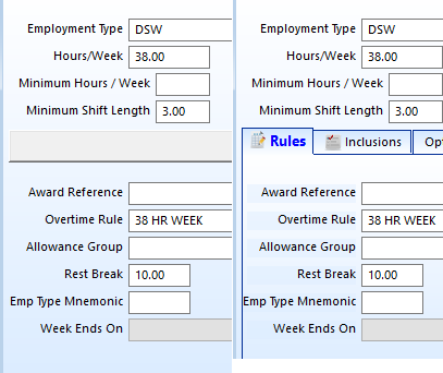
In case my words don't make any sense, here's a pic of what I mean.
Without a tab on the left. With a tab on the right.


Comments
Just to ensure I understood what you meant by lower tab order, I tried separately with the tab control first being a higher number than the controls it contains and then switched it to ensure that it was a lower number than the controls it contains.
Result was the same either way.
Just to make sure I'm following you, is a good example of where the "problem" is observed the "Rest Break" label? I can see that it appears to use the background of the form's gradient rather than the background of the tab's gradient.
1. Set the FlickerFree property to true. If that doesn't work...
2. Perhaps OI's gradient fill is overriding my code. You can get around this by placing another tab control on the form (anywhere) and making it the first control. Turn off OI's gradient fill. Set the tab's CustomColor to match your OI's gradient. Set the FillParentBackground to 1, and that will make the gradient fill the entire parent. Set it's FlickerFree property to 1 to boot.
Yes "Rest Break" and the three above it. The closer to the top of the tab, the more noticeable the contrast.
Kevin.
Generic routine to initialise all tabs so flickerfree is always set to true. (which reminds me I need to create a promoted close event to turn it off because I'm sure I've forgotten to do that in some windows). Should it perhaps be set before or after certain other properties?
I see how the work around would work but would that not mean, then adding the tab control to every window in the app so that every window is consistent? If so, not a practical alternative I'm afraid.
One point is that the closer to the top of the screen, the tab starts, the less contrast there is. Obviously this is because the tab itself more closely represents the window gradient behind it. I guess one possibility is to be a little cleverer with setting the pane background. Rather than just setting the same gradient as the window I could try using some percentage based gradient so that the lighter part of the tab is less, the further down the window the tab starts. This may help bring the tab gradient more in line with the actual window gradient.
Food for thought for later. Just thought I'd ask the question while I had an example staring me in the face.
Must explicitly set the AllowXPTheme property to false.
The connection however was found in the remarks section of the TabColors property I wasn't setting the property to true but I wasn't setting it to false either. Must set it to false to prevent the above symptoms.
Easy fix after all those creative suggestions. :)
Was only now looking at the tabcolors property for another reason when I noticed the comment.
It's also possible that I had read the comment previously but misunderstood the "must set to 0" as I had a reference to the property in my initialise routine but had then commented it out so that I wasn't setting it to true.
Not setting it to true is not the same as setting it to false.